

From Overwhelmed to Organised: Elevating The Flower Fox Studio
Running a creative business should feel fulfilling — not frantic.
When The Flower Fox Studio came to Rebecca Hobbs Studio, her work was beautiful, her reputation strong, but her online presence and systems were no longer supporting her day-to-day business.
Like many florists and creative business owners, she had outgrown the tools she originally set up — and it was starting to show in her workload.
This project was about more than a new look. It was about clarity, confidence, and creating a business that felt easier to run.
The Challenge: A Brand and Website That No Longer Fit
As The Flower Fox Studio evolved, her brand and website hadn’t kept pace.
She was experiencing:
- A brand identity that no longer reflected the quality or personality of her work
- A website that looked fine visually, but didn’t guide enquiries clearly
- Admin tasks taking up far too much time
- Enquiries arriving without enough information, leading to back-and-forth emails
Everything worked — but nothing worked well together.
The goal wasn’t to start from scratch, but to refine, elevate, and connect the pieces.
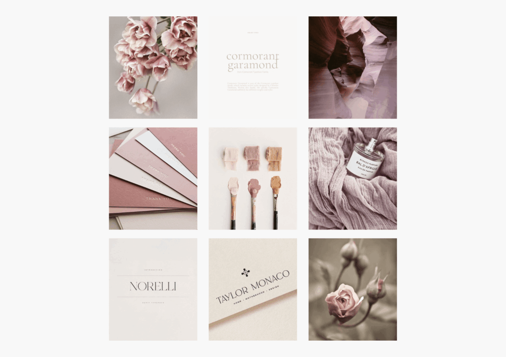
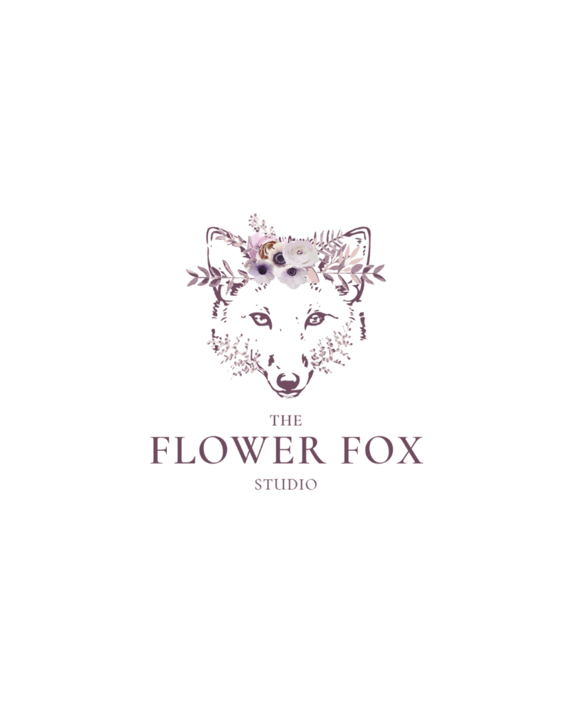
Step One: Refining the Colour Palette and Typography
TRather than starting from scratch, we focused on refining and aligning the existing brand so it felt intentional, calm, and consistent.
Updated Colour Palette
The new palette was designed to feel soft, grounded, and floral, while still giving enough contrast for readability and structure:
- Charcoal Ink (#3c3232) – Used for body text and headings
A softer alternative to black, creating warmth while remaining highly legible. - Fox Plum (#6e4b5e) – A rich accent tone
Adds depth and elegance, ideal for highlights and call-to-action moments. - Dusky Mauve (#A98A9A) – A muted floral mid-tone
Reflects the romantic, garden-led nature of her work without feeling overly sweet. - Blush Dust (#e4c8c7) – A gentle supporting pink
Softens layouts and adds warmth without overpowering imagery. - Warm Taupe (#ece7e4) – A grounding neutral
Helps balance the palette and allows floral photography to shine. - Linen White (#f6f3f1) – A clean, warm base
Keeps the site light and airy while avoiding stark white.
Together, these colours feel cohesive, natural, and quietly confident — perfectly suited to a floral studio rooted in artistry and detail.
Typography Choices (And Why They Work)
Typography plays a huge role in how a brand feels.
For The Flower Fox Studio, we introduced a carefully balanced mix of serif and sans serif fonts:
- Cormorant Upright (serif)
Used for key headings and moments that need elegance.
Its classic serif structure brings a sense of refinement and romance. - Cormorant Infant Light (serif)
A softer, more delicate serif used for subheadings.
It complements Cormorant Upright beautifully while feeling lighter and more fluid. - Karla (sans serif)
Used for body text and functional elements.
Clean, modern, and highly readable — Karla balances the decorative nature of the serif fonts and ensures clarity across the website.
Why this pairing works:
The serif fonts bring character, tradition, and softness, while the sans serif font keeps everything grounded and easy to read. Together, they create a brand that feels both romantic and practical — a perfect reflection of The Flower Fox Studio.
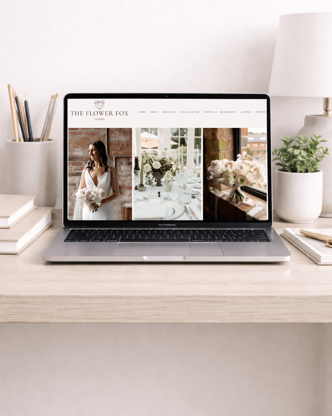
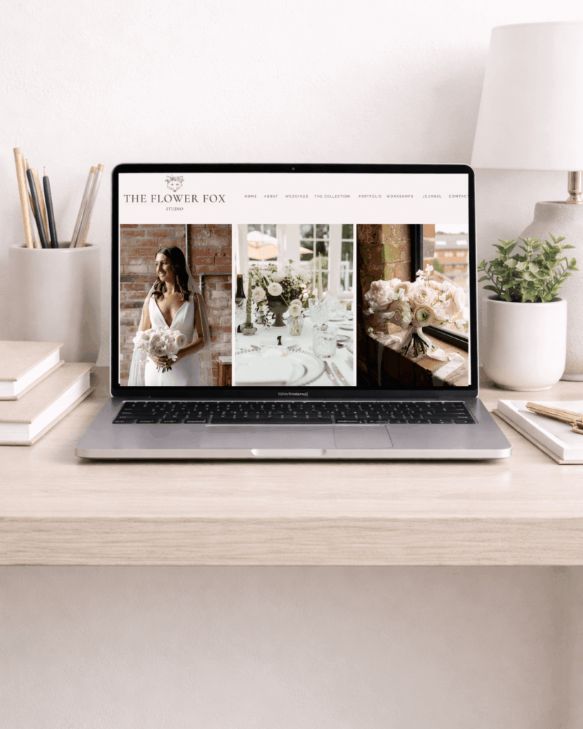
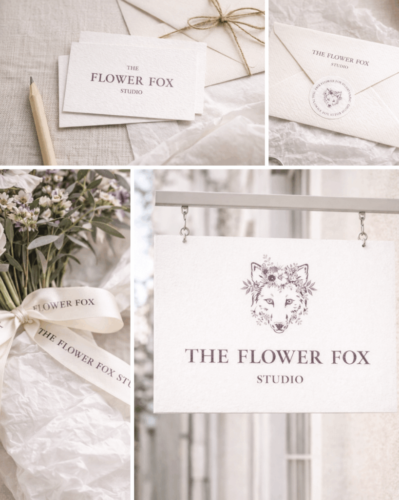
Step Two: Developing a Website That Actually Works
A website should do more than look pretty — it should support both the client and the business owner.
For The Flower Fox Studio, the website needed to:
- Clearly explain her services
- Guide visitors effortlessly to the right next step
- Reduce repetitive admin questions
- Feel fully aligned with her refined brand
We restructured the site with clarity in mind — improving page flow, simplifying navigation, and allowing the updated branding to shine without distraction.
Step Three: Incorporating Dubsado to Simplify the Workload
This is where the biggest transformation happened.
We introduced Dubsado to:
- Streamline enquiries
- Collect the right information upfront
- Automate proposals, contracts, and workflows
- Create a smoother experience for both client and florist
By integrating Dubsado directly with her website, enquiries now arrive organised, informed, and ready to move forward — dramatically reducing admin time and mental load.

The Result: A Business That Feels Lighter to Run
After the project, The Flower Fox Studio had:
- A cohesive brand with aligned colours and typography
- A website that reflects the quality of her work
- Systems that quietly support her behind the scenes
- A calmer, more professional client journey
Most importantly, she gained space — to focus on creativity, clients, and the work she loves.
Thinking about refining your own brand or website?
If your business has evolved but your website and systems haven’t caught up, I’d love to help you create something that feels calmer, clearer, and easier to run.